Redesigning CAAP's Website and Artist Directory

Project Timeline
Duration: 3 Week Design Sprint
March 2024 - June 2024
Role
Co-lead UX Designer
Project Overview
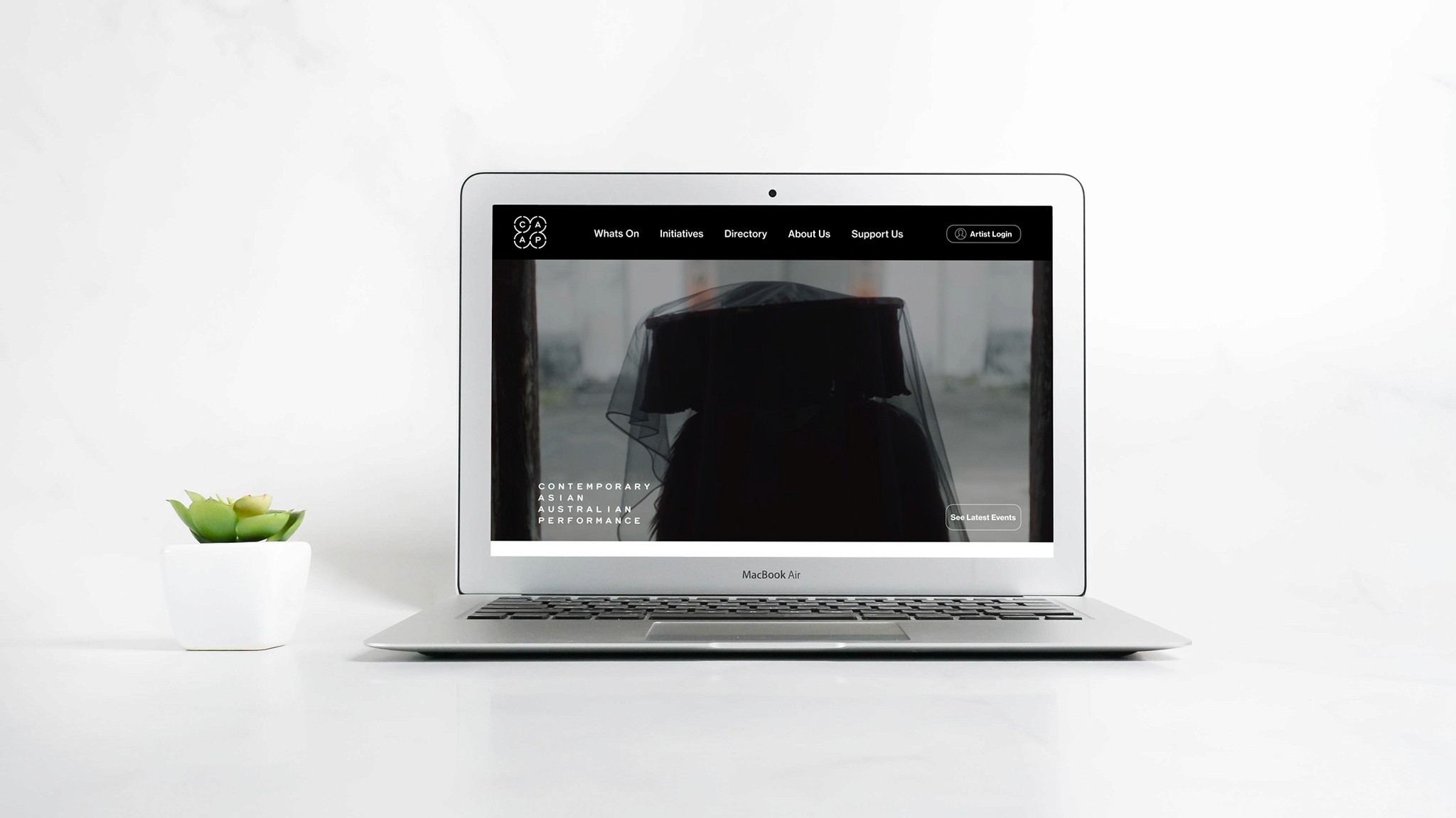
We transformed the Contemporary Asian Australian Performance (CAAP) website to spotlight their impactful work and maintain their core values. Our redesign included a modern, credible, and engaging online presence and a revamped artist directory for connecting Asian Australian artists and performers.
By infusing modern design elements, we enhanced the site's credibility and ensured seamless accessibility and engagement for all visitors.
Solution
We enhanced the CAAP website by creating an engaging homepage with testimonials and an events page that consolidates current and past events, complete with filters to search by year.
Additionally, we improved the artist directory by refining the search filters and redesigning user profile pages for better usability.
Research & Design Process
Heuristic Analysis
User Interviews
Current State Usability Test
Survey Data
Competitor Analysis
Research Synthesis
Problem Statements
User Personas
User Flow
Journey Maps
Sketching
Mid-Fidelity Prototype
Mid-Fi Usability Test
High Fidelity Prototype
Client Handover
Context
To re-design & enhance the user experience of the existing CAAP website.
The objective was to enhance the website to spotlight CAAP’s impactful work while staying true to their values.

Research Methods
We used six research methods to identify key issues and trends, gathering insights from both CAAP members and those unfamiliar with CAAP for a broader perspective.

Current Website
Key Findings
From our research we uncovered three key issues on the existing website.
Users experienced difficulty distinguishing between current and past events.
The navigation bar labels and categories were unclear, causing confusion.
The artist directory was disorganized, and the search and filter functions were confusing for most users.
We also observed that while the CAAP community was cherished for its supportiveness and community, attitudes shifted negatively when discussing the website.
“Website errors make it look a bit dodgy and reduces the brand in my mind...”
“I want to have an easier way to find people in the Artist Directory with similar skills...”
“Would be nice to see all of their shows/ projects organized and have complete dates in one page...”
Our goal was to improve the website so that users would have a positive experience, mirroring their sentiments toward CAAP.
“I think they're an amazing organization, which has literally single-handedly kind of changed the face of Australian theatre.”
“it's a really, it's a very supportive space. They've created it in a way where it's not like you're in competition with everyone.”
“I joined the CAAP artist directory mainly for the reason of wanting to be in a community with different artists here in Australia”

Artists
Artists primarily use the website to show their profiles in the artist directory. These are the users who also want to know about upcoming workshops, initiatives and programs.
We identified 2 Key Users

Patrons
People who enjoy the events and shows. They like to find out about productions, and how they can support by giving donations or booking tickets for shows.
Artists
An artist logging into the artist directory would experience pain points when wanting to search for specific people in its current state.
Artist Directory is not user friendly


Patrons
A patron first arriving at the website would see a design that seems outdated, would find it hard to see current or past events and would find the website confusing to navigate through.
Navigating through CAAP Website is Confusing

Problem Statements

Designing two User Flows
We designed two flows one for artists logging into and searching through the artist directory and another for patrons


Improving Navigation
We simplified navigation categories based on feedback through user testing.
We did this by consolidating events in to current and past and removing ambiguous labels.

Design
We sketched out concepts and ideas for our two user flows.


Mid-Fidelity
We created a mid-fidelity prototype
which we took into user testing
User Satisfaction Results
When comparing the user testing results of the current CAAP website to our mid-fidelity prototype, we saw a significant increase in user satisfaction ratings.
After testing, we refined the website into a high-fidelity prototype, achieving a perfect 5/5 rating.
100%
Gave 4/5 ratings for the overall user experience of the redesigned CAAP Website


What users said Before?
“Mish-mash of things like a blog like everything has been dumped in”
What users are saying Now
“Makes me feel like its very contemporary, modern, engaging and an interesting vibe.”
Key Features
Re-cap of key features in final product
New Artist Directory Login
Improved visibility of login with a clear and
familiar process including additional login
options.
Re-imagined Artist Directory
Search
Searching through the artist directory is now easier
due to improved filtering.
Event Page Filter Function
Users can now navigate current & past events
via a filter function.
Dynamic Event Calendar
A colour coded calendar that updates based on
venue chosen for a clear visual representation for
users looking to purchase tickets.