
Project Timeline
Duration: 3 Week Design Sprint
March 2024 - March 2024
Role
Co-lead UX Designer
Project Overview
NextStop is a city navigation app that helps users compare transportation options (trains, buses, bikes, scooters, etc.), plan routes, and track city traffic.
I created a mid-fi prototype and reimagined a navigation app, that aimed to be user-friendly, making route planning simple and intuitive.
Solution
An app designed to make route planning effortless and efficient.
The app allows a range of customization options or allows users to bypass options & begin navigation with minimal taps.
The app offers quick comparisons and addresses the need for diverse route options with customizable route buttons which you can pre-program to set a route based on what's most important to the user.
Research & Design Process
User Interviews
Synthesis
User Persona
User Flow
Mid-fidelity prototype
Usability Study
High-fidelity prototype

The Brief
Design a navigation app that is easy to use and provides clear options for users to create routes to their destination.
The Problem
Current users of their app report it being disorganised making it difficult for users to navigate.
The Solution
By conducting user research starting with user interviews to gauge what users want & need.
User Interviews
What We Aimed to Discover
Navigation Preferences: Understanding how people navigate the bustling streets of Victoria/Melbourne, including their preferred modes of transport and the reasons behind their choices.
Transport Modes: Identifying the modes of transport people rely on, from walking and cycling to driving and public transit.
Navigation Apps: Investigating the popular navigation apps that people use, why they choose these particular apps, and exploring any pain points they encounter.
Crucial Features and Information: Uncovering the features and information that are essential to users when navigating the urban landscape.
Key Questions We Addressed
How do users navigate?
What mode of transport are they using?
What navigation apps are they using?
Which features are crucial, and what are the main pain points?
“I want real-time updates on changing route conditions, roadworks, traffic and speed cameras”
“I want to know ETA from within the app”
“I want separate ETA information for different modes of transport”
“I want to choose my route by comparing the ETA’s”
“I want to know about interesting destinations near or along my route”
“I want alternative route options”
“I want to choose my route based on factors such as ETA and traffic conditions”
What Users Wanted
Research Insights

What users valued most were, Real-Time updates,
ETA information, Route Information & Options.


Problem Statement
How can we provide users a quick and easy way to compare routes using various criteria like estimated time of arrival (ETA), cost, or mode of transportation? So that users can select their preferred route according to their priorities, allowing them to plan their journey effectively and giving them multiple options.
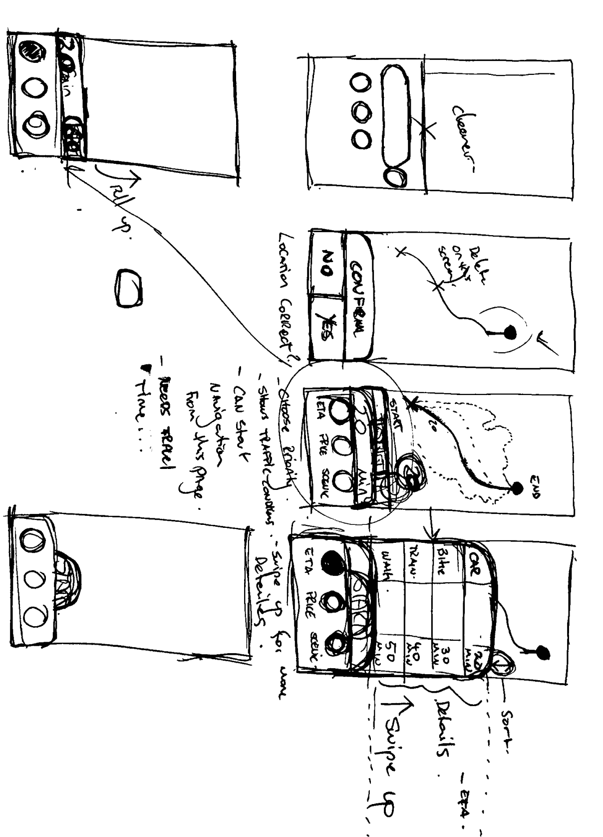
Ideating
To address the problem statement, I engaged in an iterative sketching process to develop a robust concept. This approach allowed me to explore various design possibilities and refine ideas through multiple iterations. Ultimately, these sketches served as a foundation for creating an effective and well-thought-out solution.

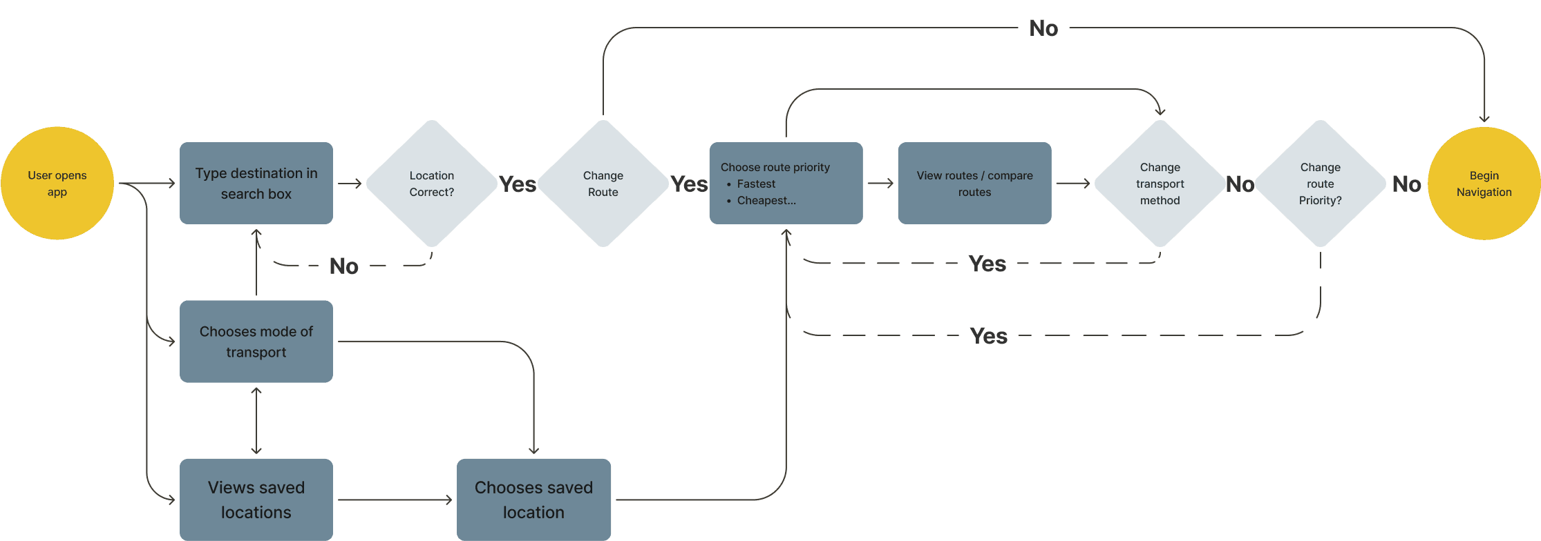
User Flow
The final user flow to test how a user would open the app and input a destination, then begin a navigation.
The flow allows for users to customise their route or change their mode of transport.
The allowance of options was important as the word route options came up in the user interviews numerous times. This user flow has been created to allow for those options in order to reaffirm the original findings of the user interviews.
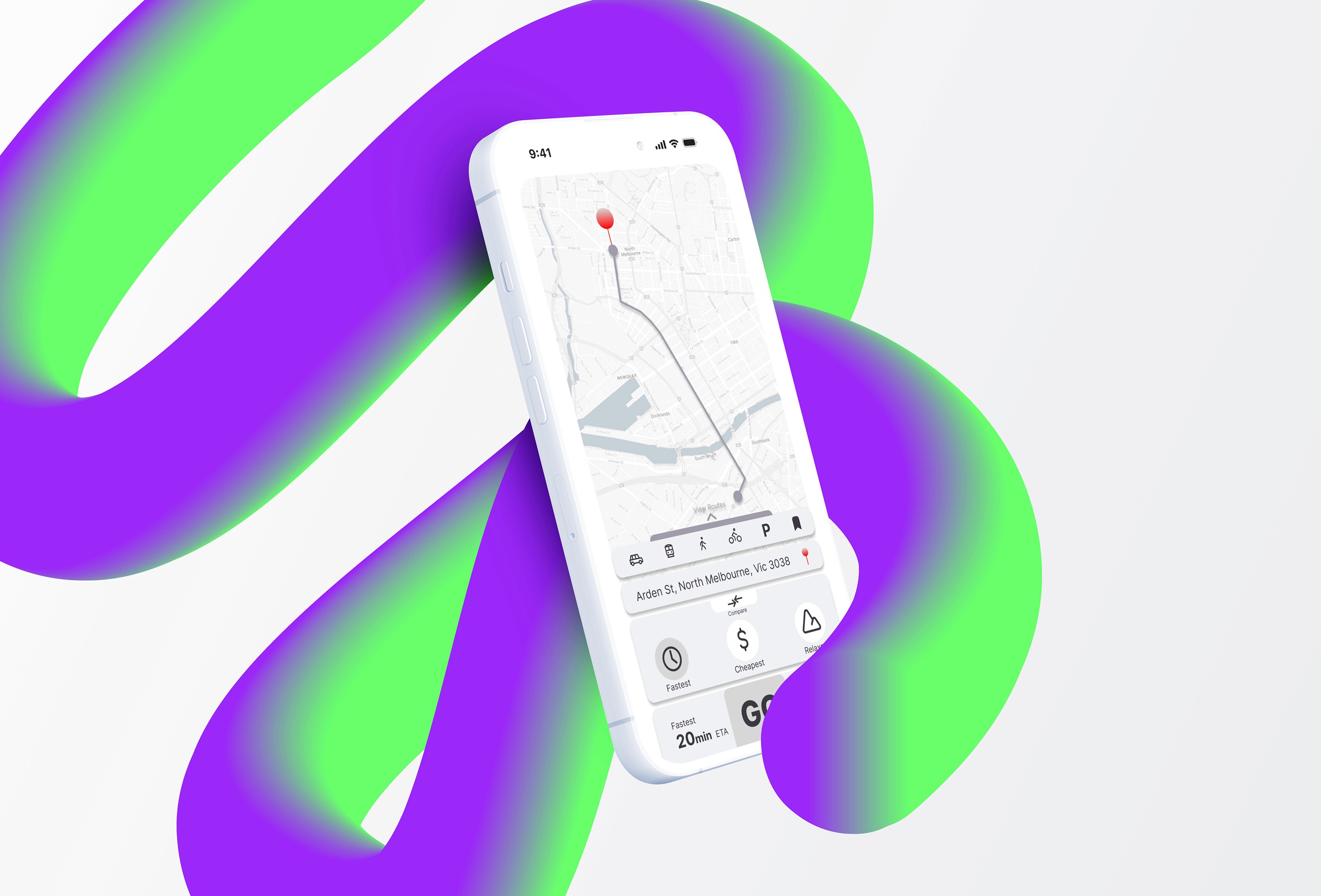
Prototype V1
This app is aiming to provide an easy and quick way for users to check and compare routes before beginning their navigation.
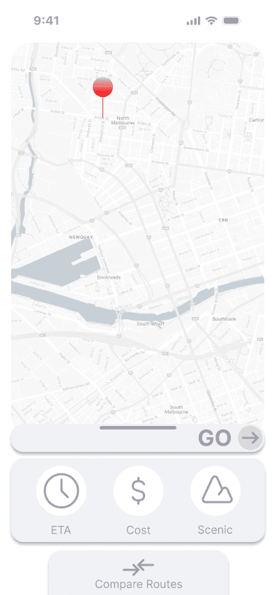
The home screen is minimal with a map, option to choose transport, a bookmark button for saved locations, a share location button and a typical search bar.
The app also allows the user to skip the choices and start navigation with minimal taps if they are not interested in customizing or viewing the routes. What we are trying to provide through this are options.
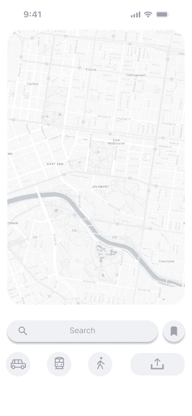

Transport Select
Search Bar
Saved Location
Share Location
Saved Locations
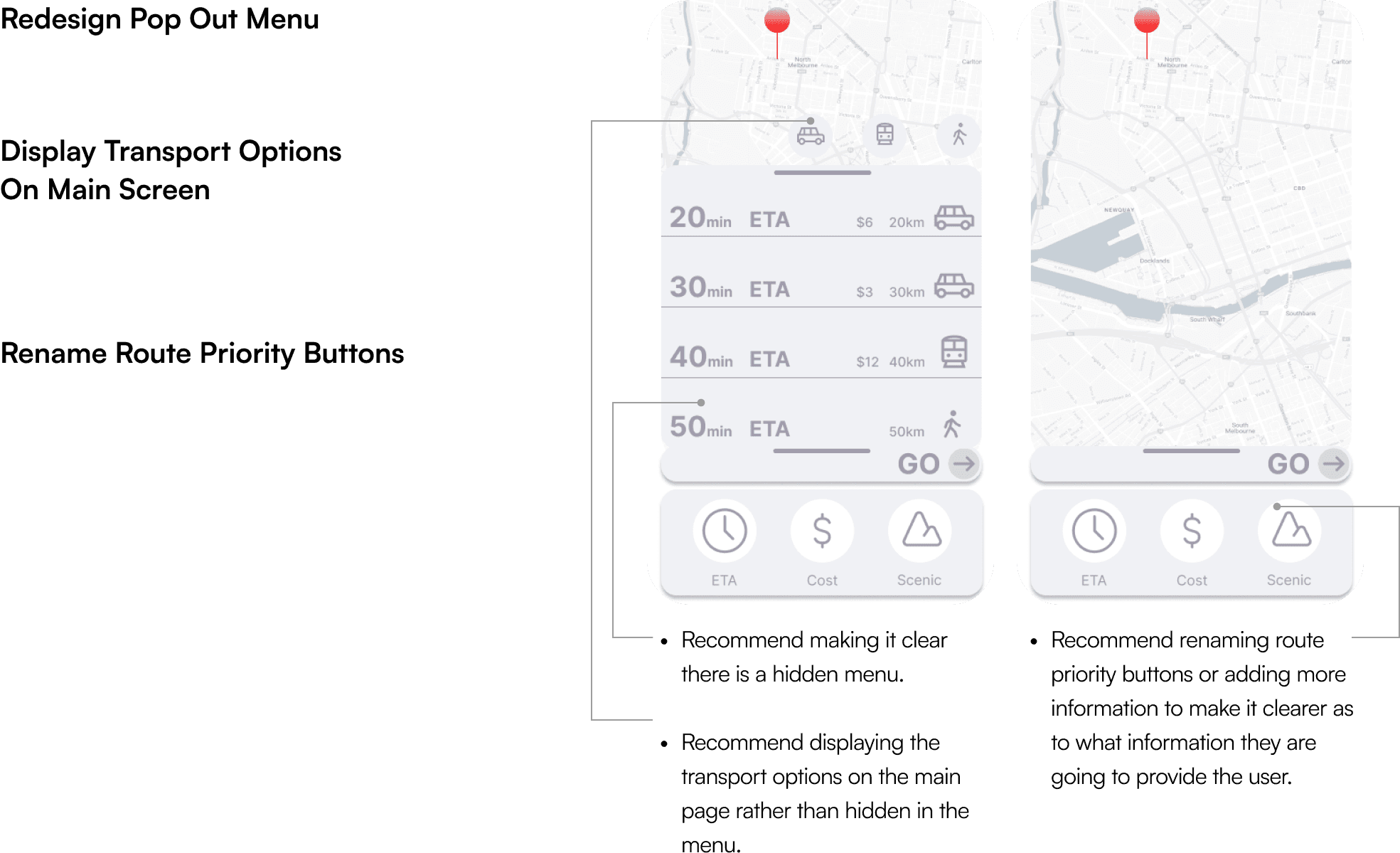
Pop out Menu

Route Priority
Compare Routes
Go Bar
Pop Out Menu
Change Transport
Prototype V1
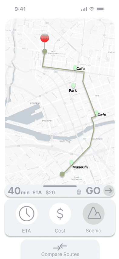
I added three customizable buttons at the route selection pages that sorts routes based on a predefined criteria. For the purposes of the prototype and by default the buttons sort by either, the quickest route, cheapest route or the relaxed / scenic route.
These buttons try to solve the issue of users wanting more route options and allows them to quickly compare routes. The idea is that users may be able to, in the future, customise what these buttons prioritise and create their own route sorting criteria.

Route Priority


Route Priority
Compare Routes
Go Bar
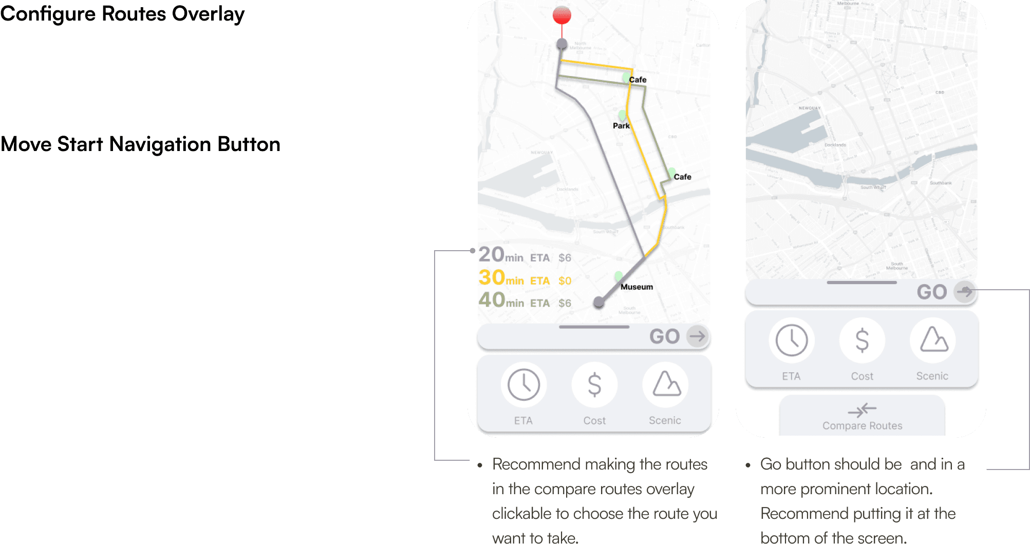
Compare Routes
Overlay
Begin Usability Testing
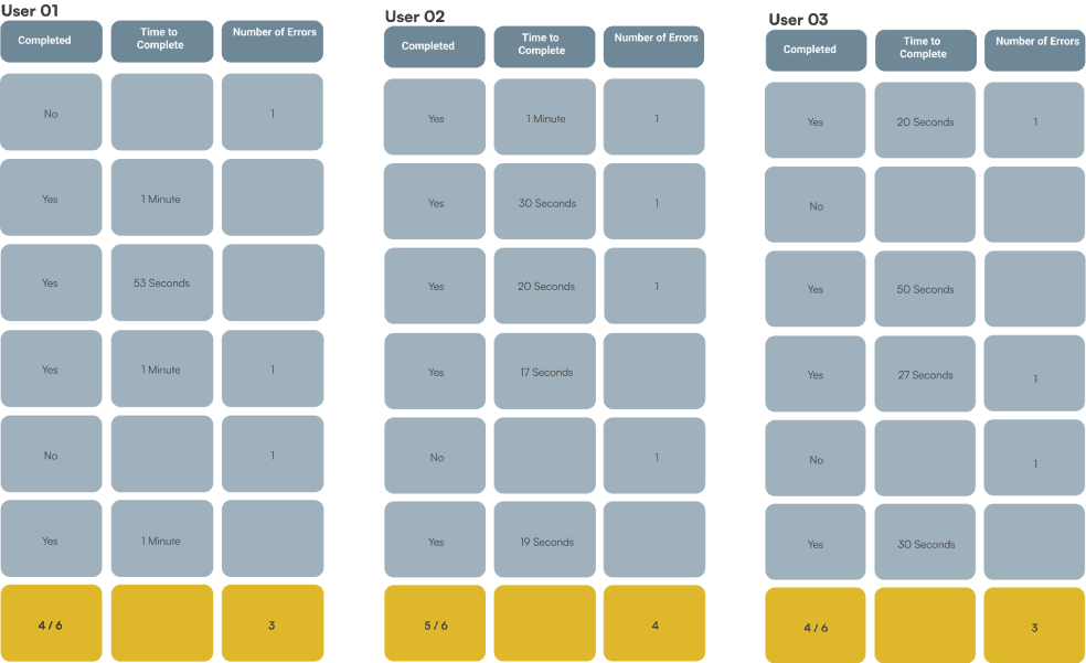
We tested the first version of the prototype with 3 users.
Here is what we found.
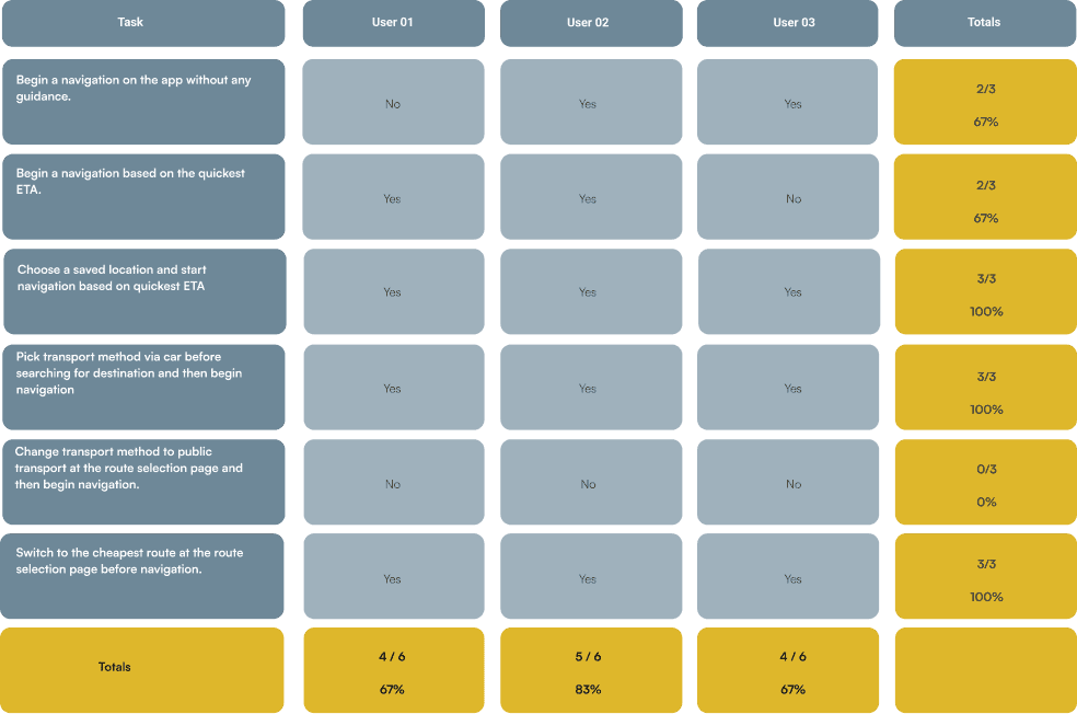
0/3
Users could find route pop out menu
2/3
Users could Begin Navigation without any other guidance
2/3
Users could Begin Navigation based on the quickest ETA
0/3
Users could change transport method at route selection page as didn't realise that there was a pop-out menu.
1/3
Users couldn't work out what the route priority buttons did as the names were not clear.
2/3
Users tried multiple times to select a route in the route overlay.
1/3
Users commented on the small GO to start navigation button.
Recommended Changes
Prototype V2
This is the next iteration following on from the usability studies that incorporates the recommendation from the previous pages.
These wire frames show the homes page through to route selection:
View routes hidden menu has a clearer indicator that there is a menu
Parking and save location buttons added
More detailed information added to the Go bar
Share button added to share location or trip.
Compare routes button made clearer


Transport Select
Search Bar
Saved Locations
Share Location
Saved Locations
Pop out Menu

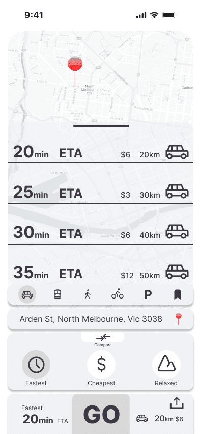
Route Priority
Go Bar
Destination Search Bar
Compare Routes
Overlay
Prototype V2
The design now shows a more intuitive layout that is easier to use and improves on the base of the first.
Route priority buttons have been renamed to be clearer
Destination bar has been added to this screen
Transport options are easier to access and displayed on the main page instead of the hidden menu.
Routes are now clickable in the routes comparison overlay
Go bar has been relocated to an easier to see location.
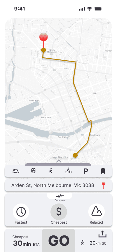


Route Priority
Go Bar
Destination
Compare Routes
Overlay

Next Steps
From here we recommend conducting another round of usability studies with different users. This will allow us to see whether the changes made to the V2 Prototype have solved the issues users were having in the V1 prototype.